

Case study · Portfolio redesign, designed and built

From a server dashboard to a design desk.

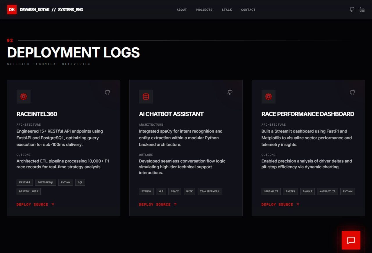
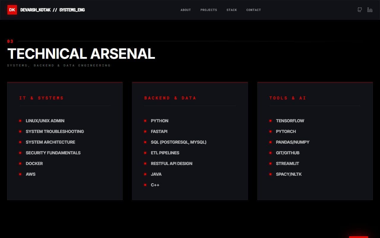
My old portfolio sold me as a backend and IT engineer looking for a job in Canada. It was black and red, set in capitals, and covered in system readouts. I've since moved into design and started a studio, so I rebuilt the site from scratch to show what I do now: design something, then build it.

Old title
Backend Engineer & IT Specialist
New title
Product Engineer & Designer
My role
Design and front end, both sites
Old site captured
17 Nov 2026
  • 5 → 8sections on the home page
  • 2 → 3typefaces, each with one job
  • 7 → 0decorative system readouts
  • 0 → 16px of corner radius on cards
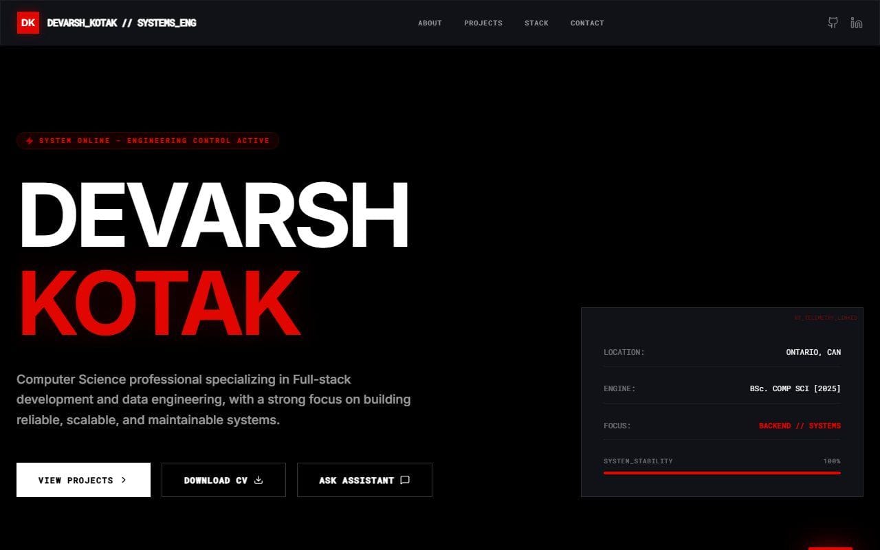
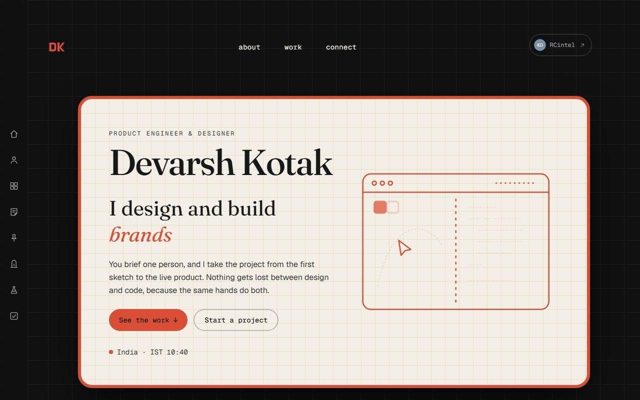
side by side

The same four sections, before and after

Both screenshots are 1280 × 800, taken from the top of each section. Drag the handle, or use the arrow keys, then switch sections below.

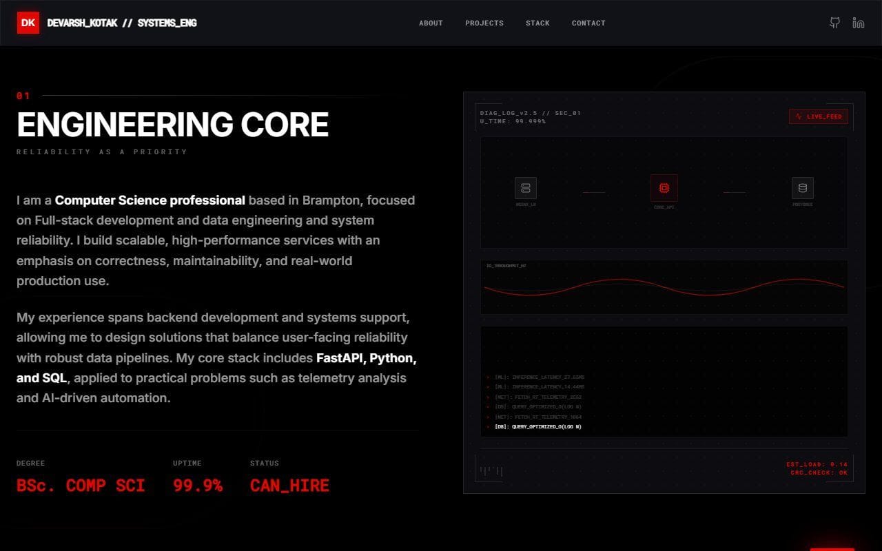
The old portfolio hero: DEVARSH in white and KOTAK in glowing red bold capitals on black, a System online badge, three square buttons and a telemetry panel showing system stability 100%.
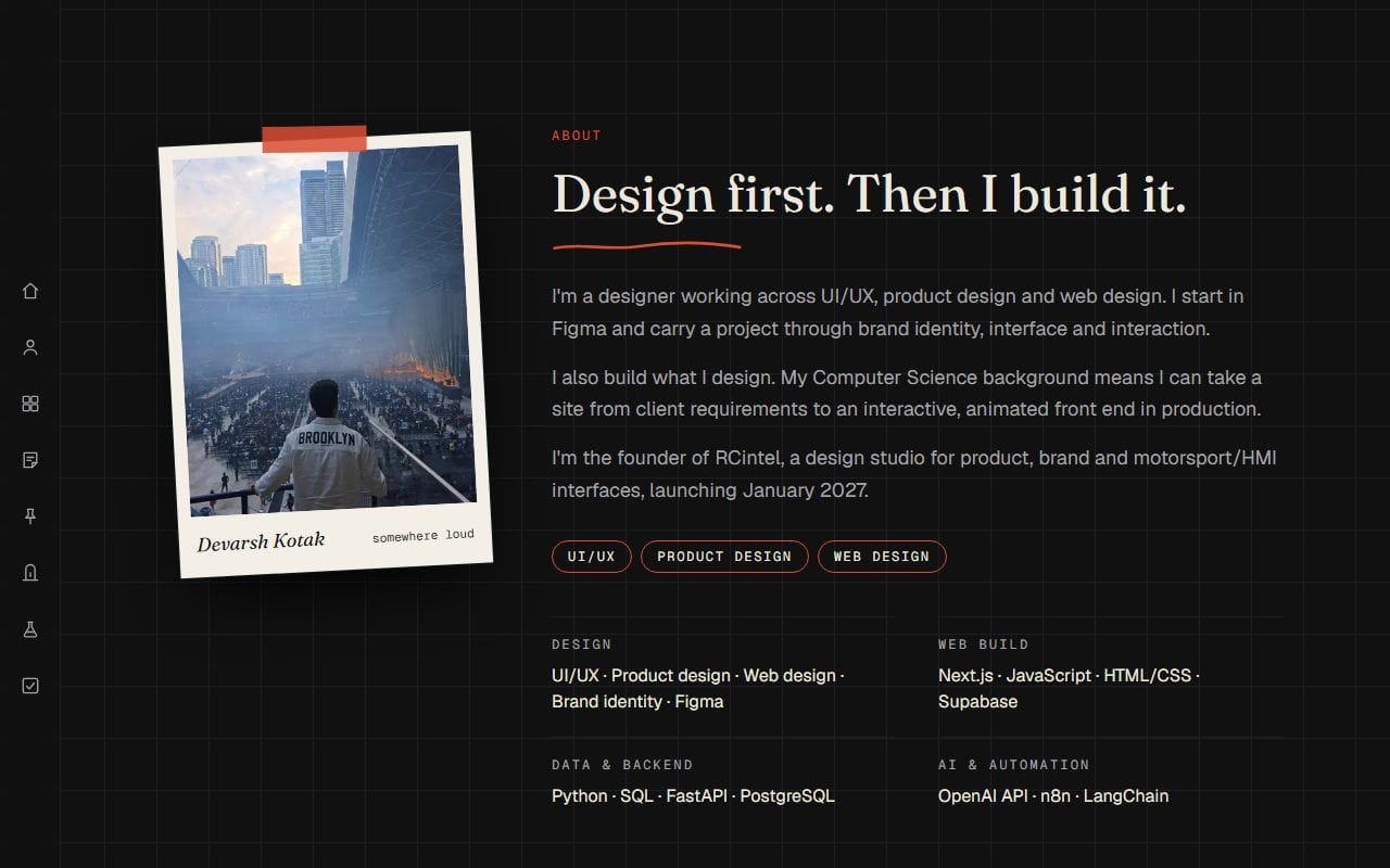
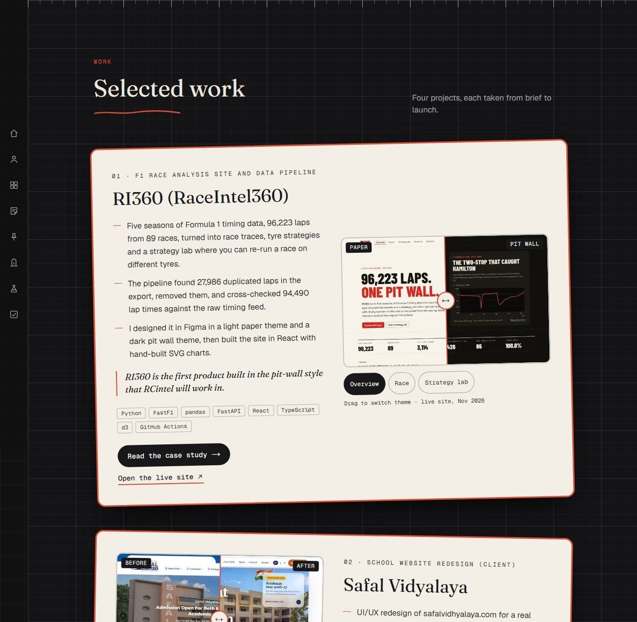
The new portfolio hero: a cream graph-paper card with a terracotta border, Devarsh Kotak in a serif face, I design and build brands, two pill buttons and a line drawing of a browser window.
Old siteNew site
Drag to compare · both at 1280 × 800
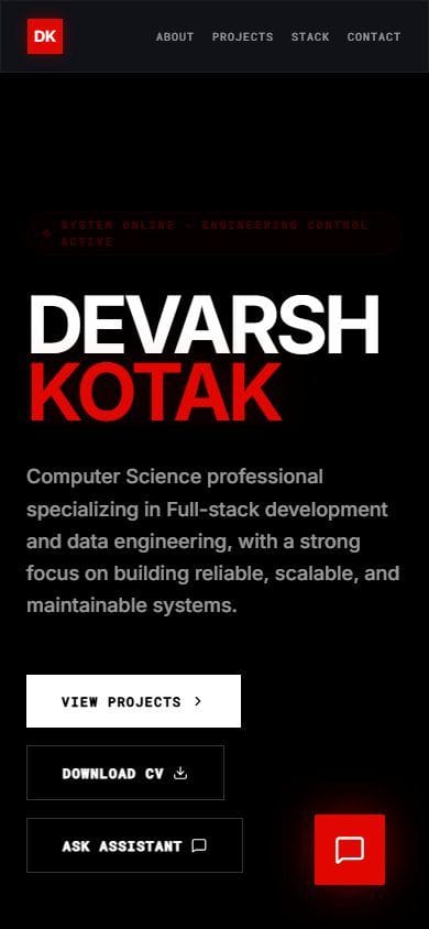
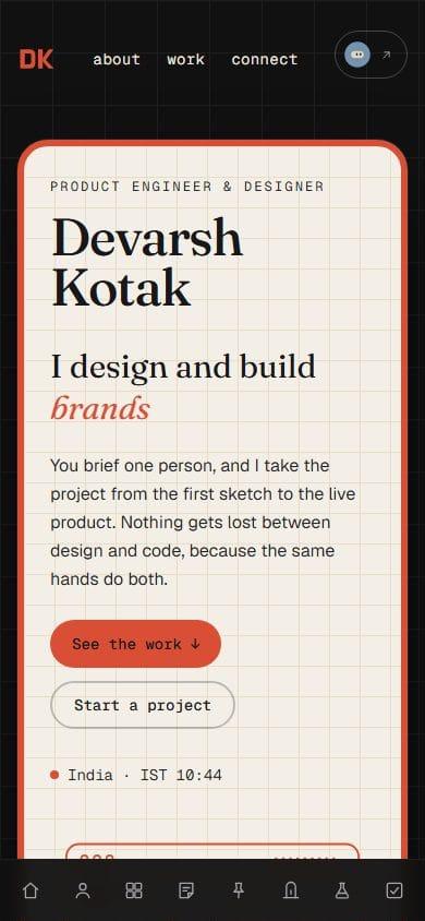
on a phone

The first screen at 390px

On the old site, the name filled the first screen. On the new one, you see who I am, what I do and two ways to act before you scroll.

The old portfolio on a phone: the name in large white and red capitals on black, a system badge and the start of the description.
Old site
The new portfolio on a phone: a cream card with the name in serif, I design and build brands, the pitch, two buttons and the local time, with an icon bar at the bottom.
New site
section by section

What each part of the page became

Every section of the old home page has a counterpart on the new one. Pick a section to see both, with what changed and why.

Old site
Old hero: name in huge white and red capitals, status badge, square buttons, telemetry panel.
Then
  • Name in 128px bold Inter capitals, with KOTAK in red and a red glow.
  • A badge reading 'System online - engineering control active'.
  • A panel with location, degree, focus and 'System stability 100%'.
  • Three square buttons (View projects, Download CV, Ask assistant) and a floating chat button.
New site
New hero: cream paper card with serif name, rotating word, pitch and two pill buttons.
Now
  • A cream graph-paper card with a terracotta border that tilts slightly under the pointer on desktop.
  • Name in Fraunces, then 'I design and build' with a rotating word: brands, websites, interfaces, data tools, automations.
  • One sentence on what working with me is like, two pill buttons, and my local time in India.

WhyThe old hero said who I was. The new one says what I make, and gives a client somewhere to go next.

New on the home page

  • Case studies

    Long-form write-ups for RI360, Safal Vidyalaya, RCintel and this site.

  • Studio bridge

    A separate door to RCintel, my design studio, so it never competes with my own work.

  • Lab

    Small motion studies, the same effects the site uses, to play with.

  • Side rail

    An icon rail on the left (a bottom bar on phones) that tracks where you are on the page.

design tokens

The system underneath

Old values were read from the live old site's computed styles. New values come from this site's design tokens.

  • Page background
    Old siteNear-black#0b0b0f
    New siteCanvas#111111
  • Accent
    Old siteRacing red#e10600
    New siteTerracotta#d94e34
  • Card surface
    Old siteTranslucent navy#15151e
    New sitePaper#f4efe6
  • Main text
    Old siteWhite#ffffff
    New siteChalk / Ink#ede8df
The system underneathOld siteNew site
HeadingsInter, bold capitalsFraunces, sentence case
BodyInterGeist
LabelsRoboto Mono, snake_caseGeist Mono, lowercase
CornersSquare (0px)Rounded (12–16px)
ButtonsSquare, white or outlinedPills, terracotta or outlined
the words

What the page said, then and now

The look changed because the message changed. Old lines are quoted word for word from the old site.

Who I am
Old siteBackend Engineer & IT Specialist
New site

Product Engineer & Designer

Opening line
Old siteSystem online - engineering control active
New site

I design and build brands, websites, interfaces, data tools, automations

Who it's for
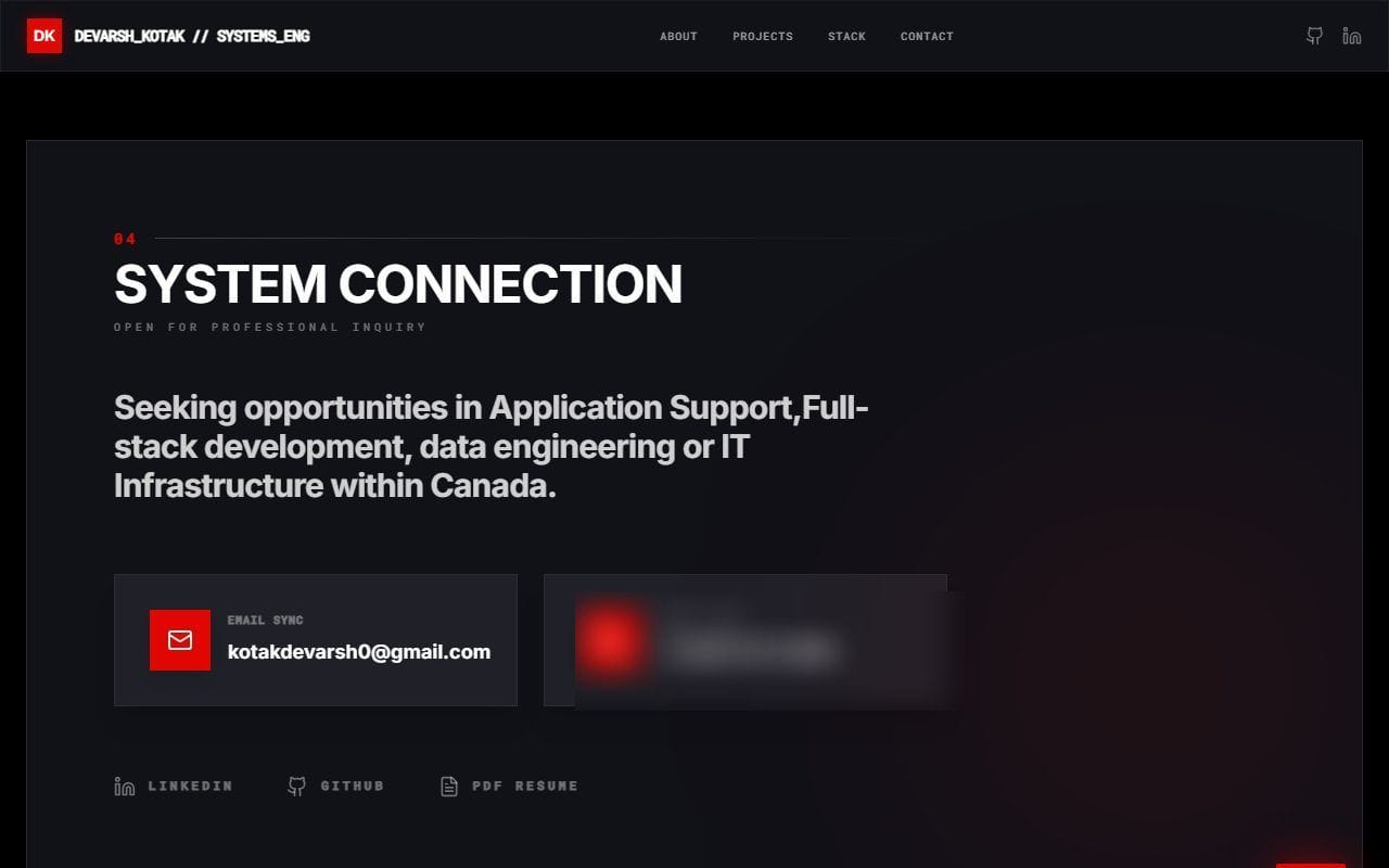
Old siteSeeking opportunities in Application Support, Full-stack development, data engineering or IT Infrastructure within Canada.
New site

You brief one person, and I take the project from the first sketch to the live product.

Numbers
Old siteSystem stability 100% · Uptime 99.9% · Cache hit ratio 98.2% · Latency 4ms
New site

No number on the page that I can't point to a source for.

Where
Old siteOntario, CAN
New site

India · with my live local time

four decisions

The rules behind the rebuild

Each one fixes something specific on the old site, and each one cost something.

  1. 01

    Lead with what I make, not my job title

    On the old site
    The first screen was my name in 128px capitals and a 'system online' badge. It told you nothing about what I could do for you.
    Decision
    The hero now says 'I design and build' and rotates through the kinds of work I take on, with a direct way to start a project.
    Cost
    A rotating word is less punchy than a giant name, and it needs a still version for reduced motion.
  2. 02

    Paper and ink instead of a control room

    On the old site
    Black, racing red and white capitals everywhere made every section look like the same dashboard.
    Decision
    A dark desk with cream paper cards on it, terracotta for anything you can act on, and a faint cyan only as light.
    Cost
    Cream cards on a dark page are a big jump in brightness, so I checked the contrast of every text pair on both surfaces.
  3. 03

    Three typefaces, three jobs

    On the old site
    Inter did headings and body, and mono labels were written like code (CAN_HIRE, SYSTEMS_ENG), which made the page harder to read.
    Decision
    Fraunces for headings, Geist for body, Geist Mono for small labels in plain lowercase.
    Cost
    Three families cost more to load than one, so they come through next/font and there will not be a fourth.
  4. 04

    Only claims I can back up

    On the old site
    Uptime, latency, cache hit ratio and 'AES-256' were decoration. They measured no real system.
    Decision
    Facts on the new site come from my resume or my studio's brand kit. Where I don't have a number, the page says so.
    Cost
    The new site shows fewer numbers. I would rather leave a gap than invent one.
the labs

Try the new system yourself

Three small tools built from the same code as the site: the springs, the surfaces and the type.

Lab 01 · Motion

Spring tuner

Pick a spring from the site, or set your own. Toss the card, or press Flick.

Springs used on this site

320

Pull towards rest. Higher is snappier.

18

Friction. Lower bounces more.

0.4

Weight. Higher feels heavier and slower.

Damping ratio
0.80
Bouncy
Settles in
178 ms
±2%
Overshoot
2%
Sandbox
Drag meDrag sideways and let go

Position over the first second

Lab 02 · Surfaces

Four surfaces

Each surface is CSS only. Pick one to see it, its tokens and the code that draws it.

Case study heroes and the work section

Cutting mat

A 96px major grid over a 24px minor grid, with a ruler along the edge.

A sample card

Tokens

  • mat base#141416
  • --color-chalk#ede8df
  • --color-accent#d94e34

Text contrast

15.1 : 1 chalk on mat · 7.3 : 1 muted text

CSS

.cutting-mat {
  background-color: #141416;
  background-image:
    linear-gradient(rgb(237 232 223 / 0.09) 1px, transparent 1px),
    linear-gradient(90deg, rgb(237 232 223 / 0.09) 1px, transparent 1px),
    linear-gradient(rgb(237 232 223 / 0.035) 1px, transparent 1px),
    linear-gradient(90deg, rgb(237 232 223 / 0.035) 1px, transparent 1px);
  background-size: 96px 96px, 96px 96px, 24px 24px, 24px 24px;
}
Lab 03 · Type

Type tester

Switch typeface, change the size, or type your own line.

32px

Fraunces · Headings

Design first. Then I build it.

A soft, high-contrast serif. It gives headings warmth next to the technical labels.

not done yet

What I haven't measured

Being honest about the gaps is part of the same rule.

  • [PLACEHOLDER: Lighthouse scores, once the site is live on Vercel]
  • There are no automated tests. I check each change by building the site and looking at it at 360px and 1280px wide.
  • There is no light theme. The site is dark on purpose, with paper cards for reading.
  • I compared the home pages only. The old site had no case studies, so those pages have nothing to compare against.

Want a site built like this?

I design it and build it. Tell me what you're making.