
A school website rebuilt around the first question a parent asks.
Safal Vidyalaya is an English and Gujarati medium school in Sector 22, Gandhinagar. I redesigned its website and built the new front end. This page shows what I changed and why.
- Client
- Safal Vidyalaya, Gandhinagar
- My role
- UI/UX design and front-end build
- Built with
- Next.js
- Status
- Demo. Not handed over yet.
The same school, two first impressions
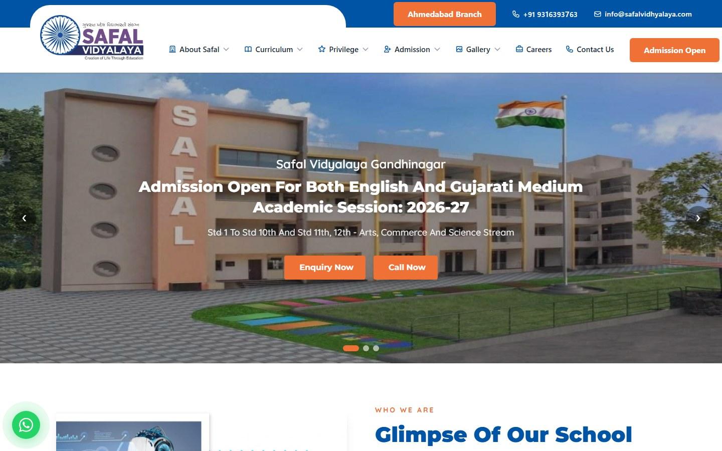
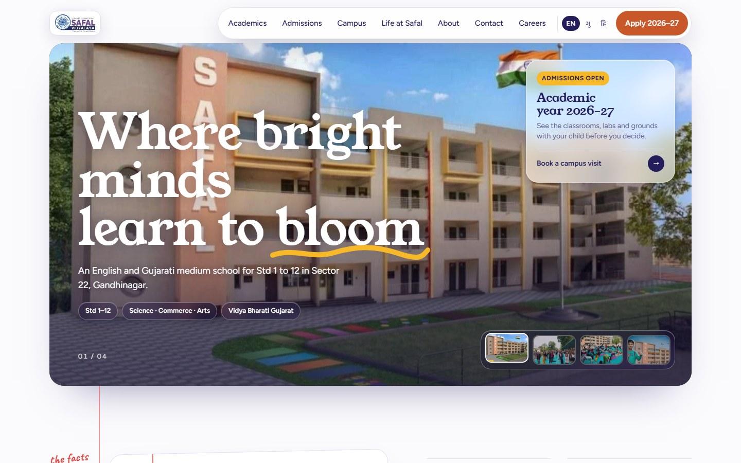
Left is the school's current site. Right is my redesign. Drag the handle across.
What I found when I audited it
These are my own observations from going through the current site as a parent would. They are not from user research.
- 01
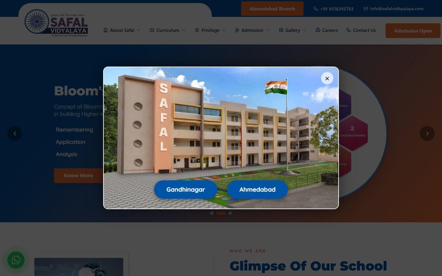
A pop-up arrives before the page does
The first thing a visitor sees is a window asking them to pick Gandhinagar or Ahmedabad. It covers the page until it is closed.
- 02
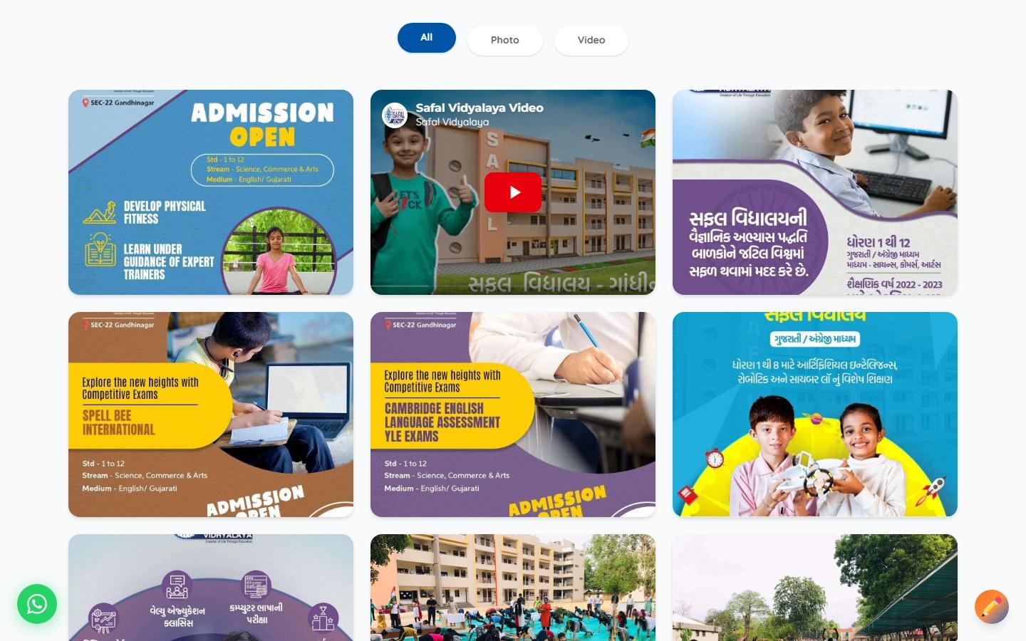
The news stopped in 2022
The newest dated post in Latest News is from December 2022. An old date on the home page makes a visitor wonder whether the rest is current.
- 03
Eighteen pages inside five menus
About Safal, Curriculum, Privilege, Admission and Gallery each open a drop-down. A parent has to guess which menu holds the syllabus or the admission form.
- 04
The first screen explains theory, not the school
Two of the three hero slides are about Bloom's Taxonomy and the Ashok Chakra curriculum model. Which standards the school teaches, in which language, and where it is come later.
Five decisions and the reason for each
I designed for one visitor: a parent deciding whether to enquire. That is my working assumption, not a research finding.
- 01
Answer the first question on the first screen
- Problem
- A parent's first question is whether this school fits their child: which standards, which language, where.
- What I did
- One headline, one line that says English and Gujarati medium, Std 1 to 12, Sector 22, and one card with a single action: book a campus visit. No pop-up.
- 02
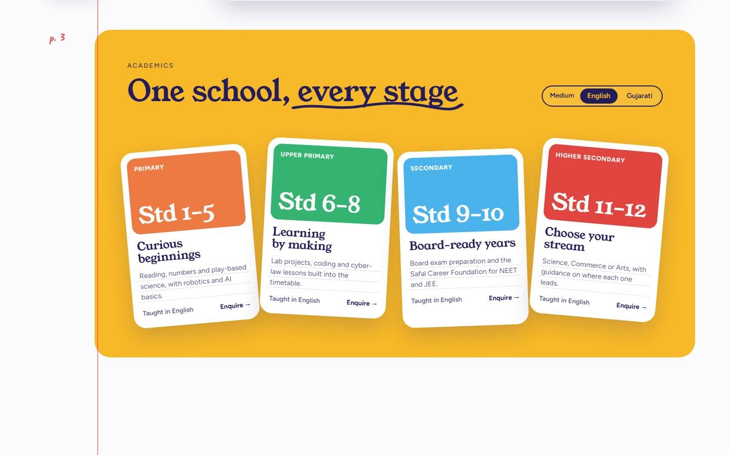
Organise by the child's stage
- Problem
- The old site was organised the way the school is run: curriculum, privilege, regulations.
- What I did
- Four cards, one per stage: Std 1 to 5, 6 to 8, 9 to 10 and 11 to 12. Each says what that stage is about and has its own Enquire link, with a switch for English or Gujarati medium.
- 03
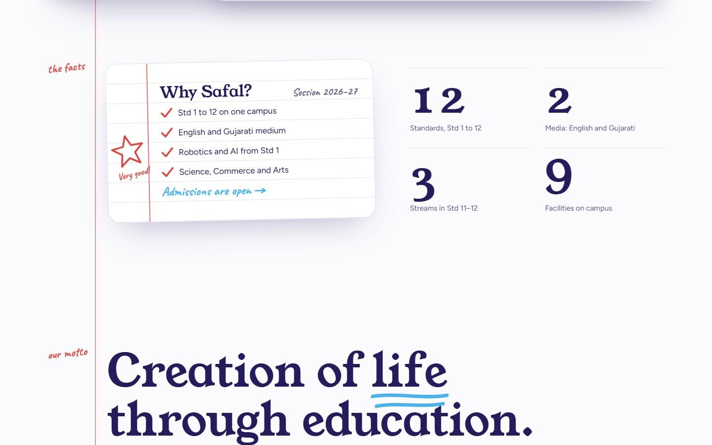
Make it look like a school
- Problem
- The old site's blue and orange template could belong to any institution.
- What I did
- A notebook: ruled paper, a red margin line, handwritten notes in the margin and a teacher's star. Facts are shown as a ticked list and four numbers.
- 04
Seven links, no drop-downs
- Problem
- Five drop-downs hid eighteen pages.
- What I did
- A flat menu: Academics, Admissions, Campus, Life at Safal, About, Contact, Careers. The Apply button stays visible beside it.
- 05
Make enquiring a thumb's reach away
- Problem
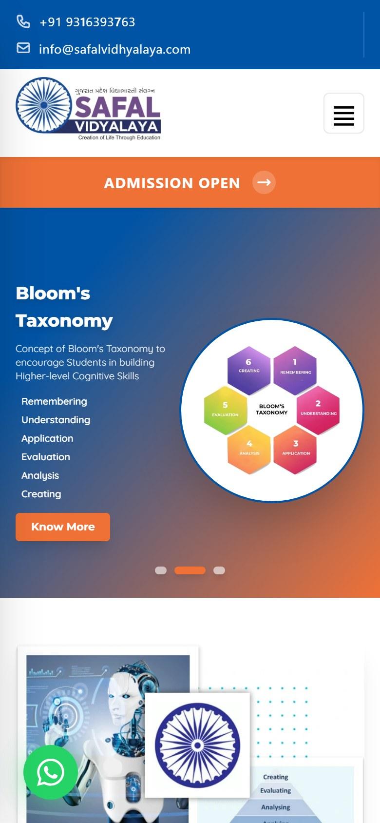
- On a phone the old site puts a hamburger menu and an Admission Open banner first. The form is at the bottom of the page.
- What I did
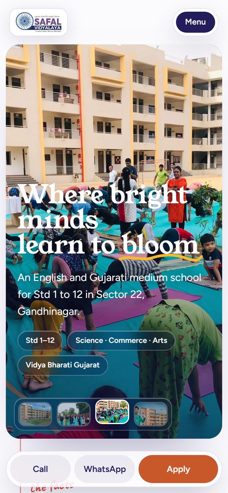
- A bar fixed to the bottom of the phone screen with Call, WhatsApp and Apply. The call-back form asks for four things: parent's name, mobile number, standard and medium. The site also has a language switch for English, Gujarati and Hindi.
The first screen on mobile
Built, but not finished
The link is a demo. I have not handed the site over to the school yet, so there are no results to report.
Done
- Design of the full home page and its sections
- Responsive Next.js front end with the animations
- Language switch for English, Gujarati and Hindi
- Enquiry flow and call-back form, on the front end
Left before handover
- The school's own photos. Some pictures on the demo are openly licensed samples, credited in its footer.
- The backend connection, so the call-back form and staff login work.
- Real parent quotes. The demo shows labelled placeholders.
- The Ahmedabad campus address, which is a placeholder.
- Alt text for the photos, and a darker overlay where the headline sits on a busy photo.
Have a website that hides what people came for?
I can audit it, redesign it and build it.